Descripción
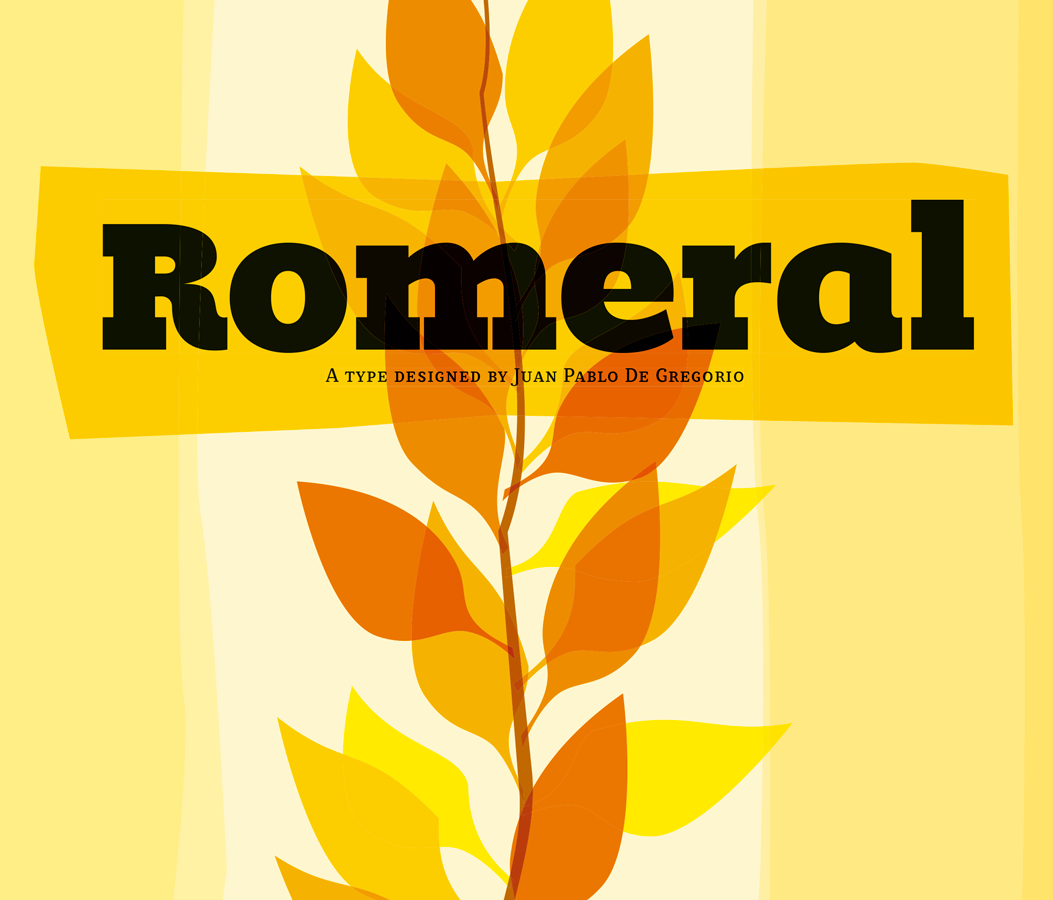
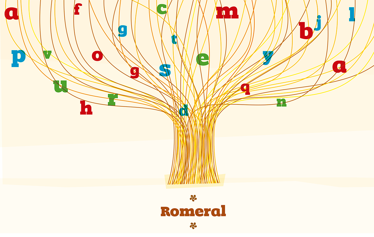
I’ve designed Romeral, a display typeface, in the beginning of 2004 in order to accompany my text typefaces.
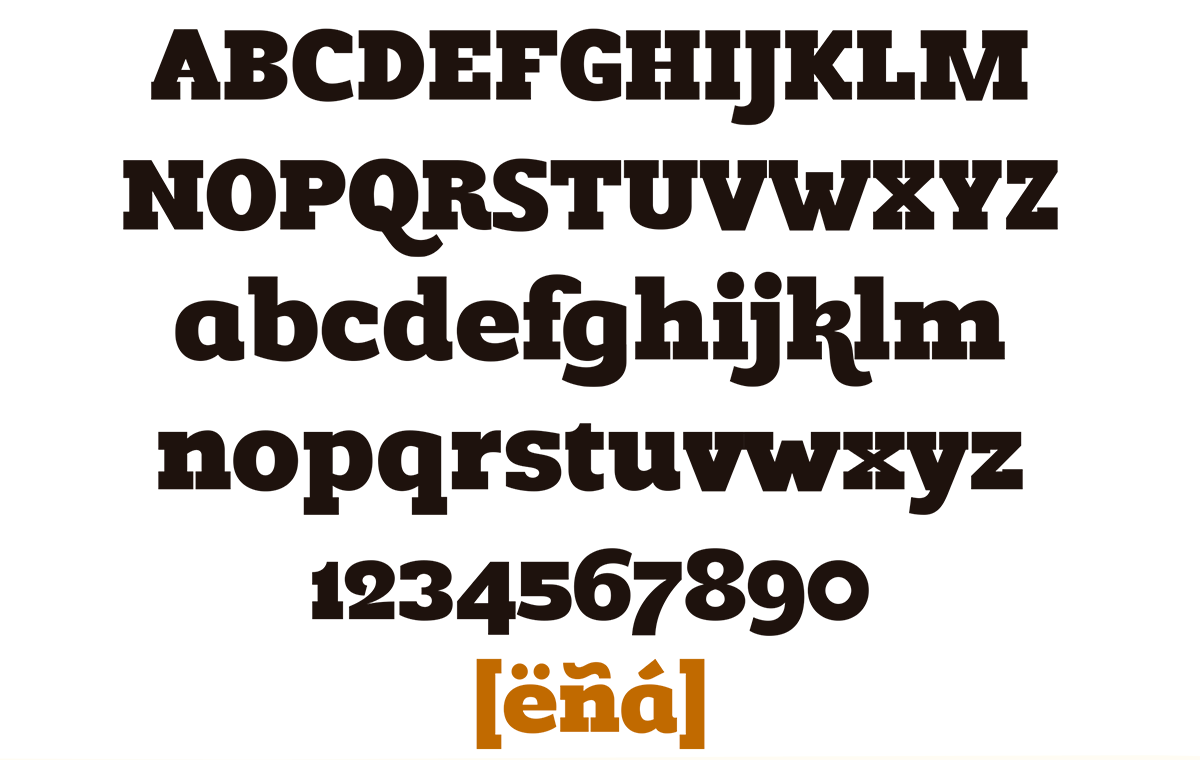
Romeral is designed to produce a noticeable visual impact that invites the audience to the reading due to its sizable thickness.
Interestingly enough, the basic idea was to find a way to fill the color titles zone in order to create a comfortable atmosphere for the reading experience.
Nowadays, the complex typography of the typefaces makes it very hard for the designer to work with it comfortably. Romeral’s straight geometric form allows an amateur designer to modify its points without much difficulty The idea is to be able to easily design a personalized layout of the text.
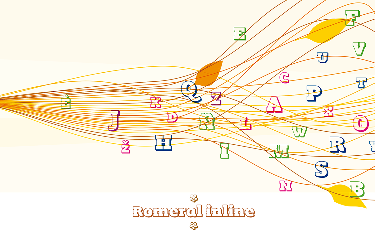
The complementary “Inline” variation allows for alternative uses of the typeface. For example, it can be used as a base typeface.




Valoraciones
No hay valoraciones aún.